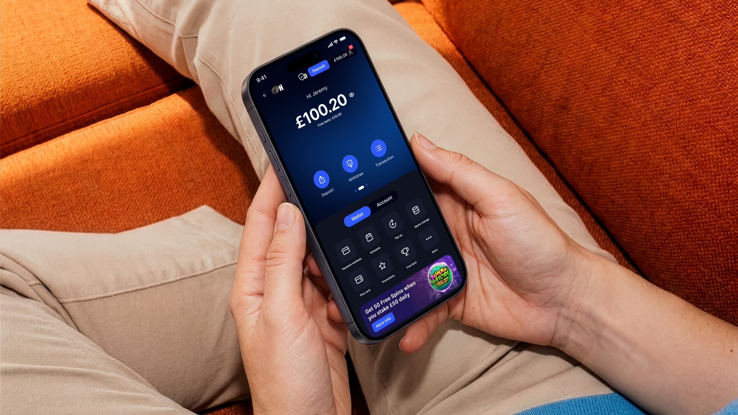
Rethinking the way customers experience payments
Overview
William Hill is one of the UK’s leading betting and gaming brands, where depositing and withdrawing money is a fundamental part of the customer experience. The existing cashier had evolved over time, but technical constraints and fragmented journeys were limiting both the customer experience and our ability to innovate.
My role
Lead Product Designer
Year
2025
Payments is one of the most frequent and emotionally charged interactions our customers have — yet our cashier was optimised for transactions, not confidence.
Challenge
Technical constraints had also made the experience increasingly difficult to evolve. What remained was functional, but fragmented, dated and disconnected from the experience we wanted to create. Payment Vision Case Study 2026
So the challenge wasn't simply to redesign the cashier. It was to rethink the role payments could play in the wider product.
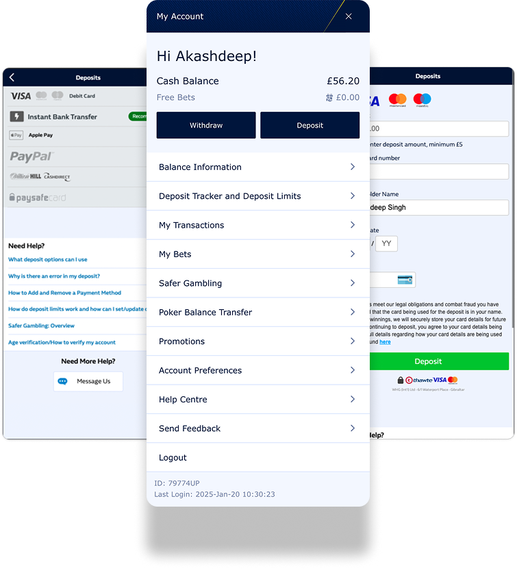
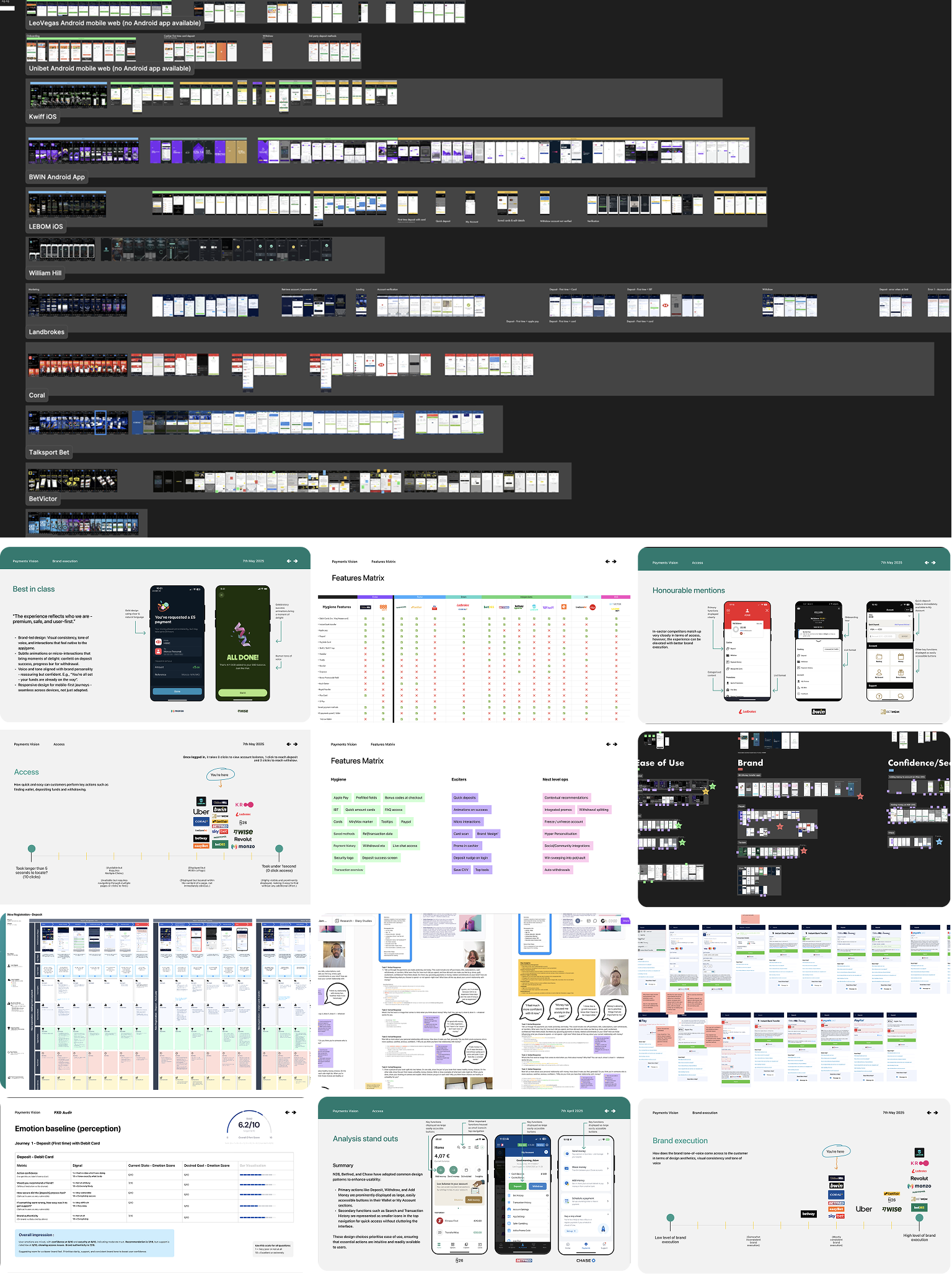
I spent a lot of the early project looking outward and inward — benchmarking payment experiences across the market, digging into existing customer pain points and comparing the features our competitors offered.
I built a feature matrix to make those differences visible. It helped us separate the things customers simply expected from the areas where we had a genuine opportunity to do something better.
Before looking forward, I wanted to understand where we stood.
Finding the gaps
Turning insight into a direction
The research showed that a best-in-class payments experience wasn’t just about making transactions faster.
Customers needed to be able to access key actions quickly, understand what was happening, feel confident moving their money and experience something that still felt distinctly part of the brand.
Those needs became four principles that guided the design:
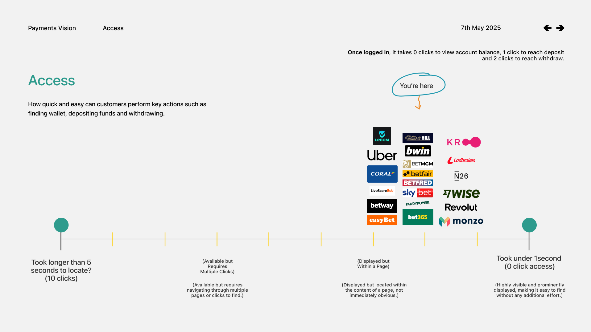
Access
How quickly and easily can customers perform key actions, such as finding their wallet and/or depositing funds
ease of use
Measures the ease of navigation through the experience; common patterns & logical sequences and clear language
Brand
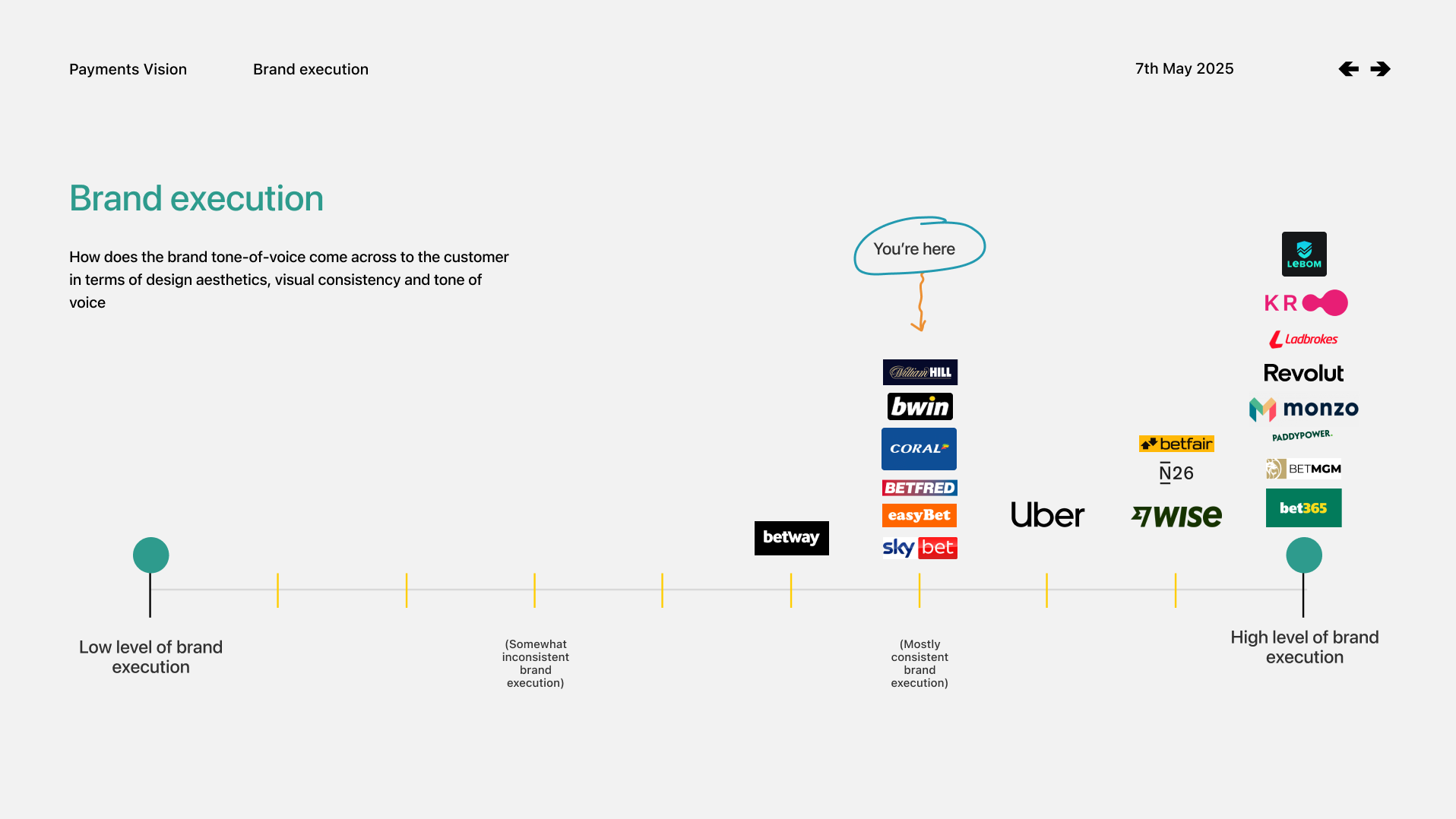
TOV comes through in design aesthetics and consistency maintains an authentic experience
confidence
How secure does the experience feel? Is support always available? Are customers confident in each interaction, do they feel safe?
They gave us a simple framework for making decisions as the vision developed.
Defining the visual direction
From a cashier to a connected payments experience
The research gave us a simple ambition: make payments easier to access, easier to understand and easier to trust.
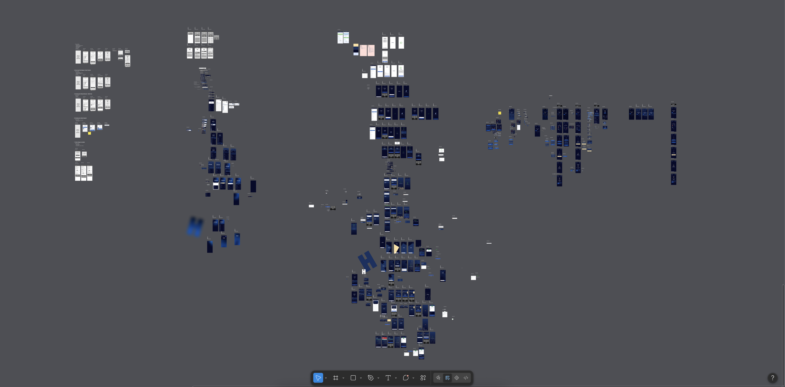
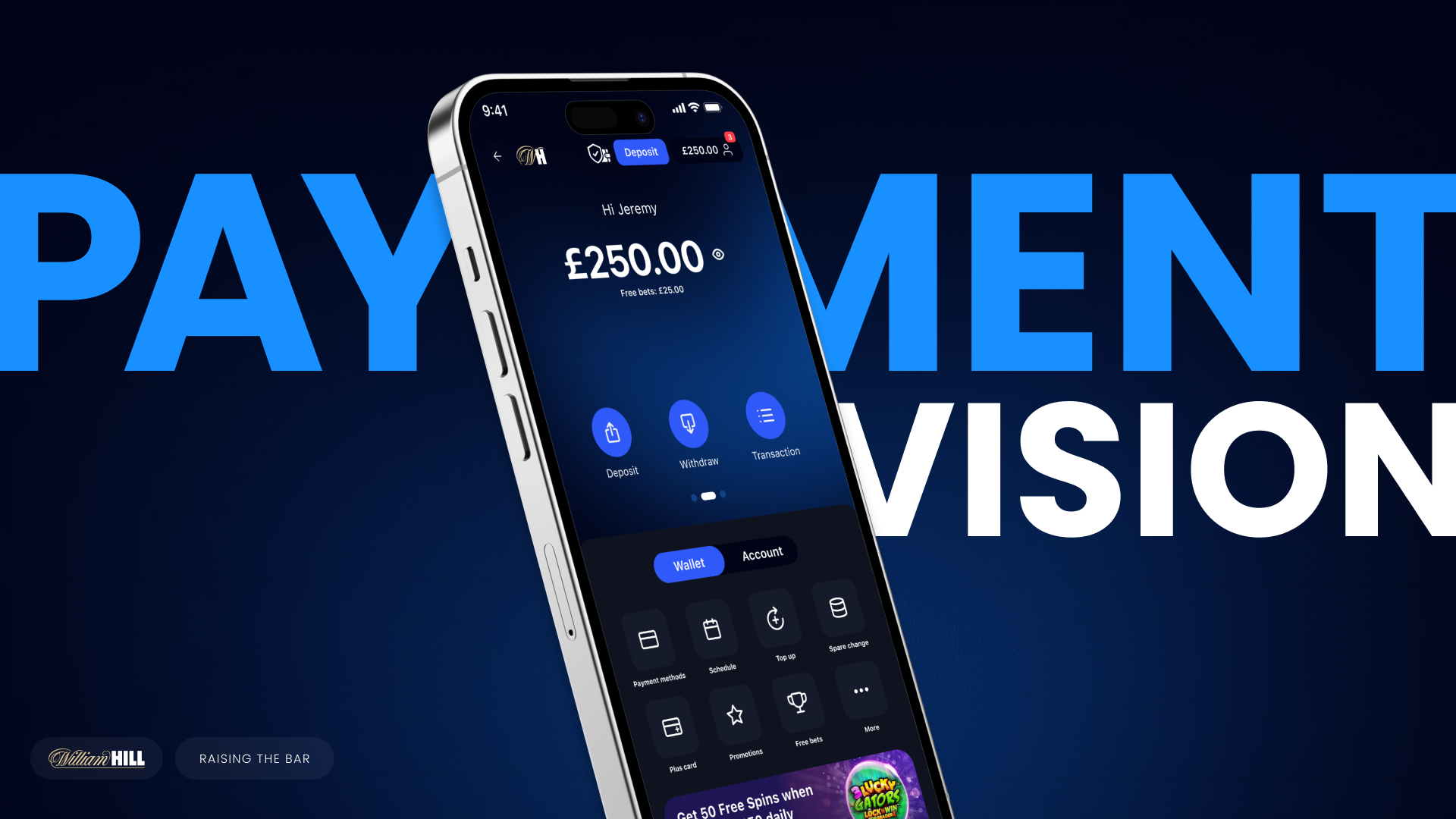
I led the visual direction from the earliest explorations through to the final concept, looking at how hierarchy, interaction, motion and feedback could make something inherently functional feel much more intuitive and alive.
Instead of designing a better version of the existing cashier, we started thinking about payments as a connected experience — somewhere customers could move money, understand what was happening and access the things that mattered without hunting for them.
The shift was from transactional and static to simple, contextual and responsive.
Validating the vision
putting the direction in front of users
We took the concept into testing to understand how people responded to the new experience — from the overall visual direction to individual interactions and new ideas.
That feedback helped us refine the experience, but it also gave us confidence that we were pushing it far enough. Customers weren't just describing it as easier to use; they were noticing that it felt different from what they were used to.
“Build it and all the others will follow.”
Customer feedback during testing
Designing for scale
building more than a one-off vision
As the vision developed, the work started feeding back into the product itself.
New patterns and components expanded the existing design system, giving teams a more consistent foundation for future payment journeys.
And when business priorities shifted towards 888, we were able to take the same thinking and adapt it to another brand — a useful test that the experience wasn't just a William Hill concept, but a system that could scale.
Defining the visual direction
With the foundations in place, I led the visual exploration for what the future payments experience could feel like.
The existing cashier was functional but static and fragmented. I wanted the new experience to feel more alive and responsive while still keeping the core payment journeys simple and reassuring.
I explored how hierarchy, motion, interaction and visual feedback could make money feel easier to understand — gradually developing the direction from early concepts into the high-fidelity vision.
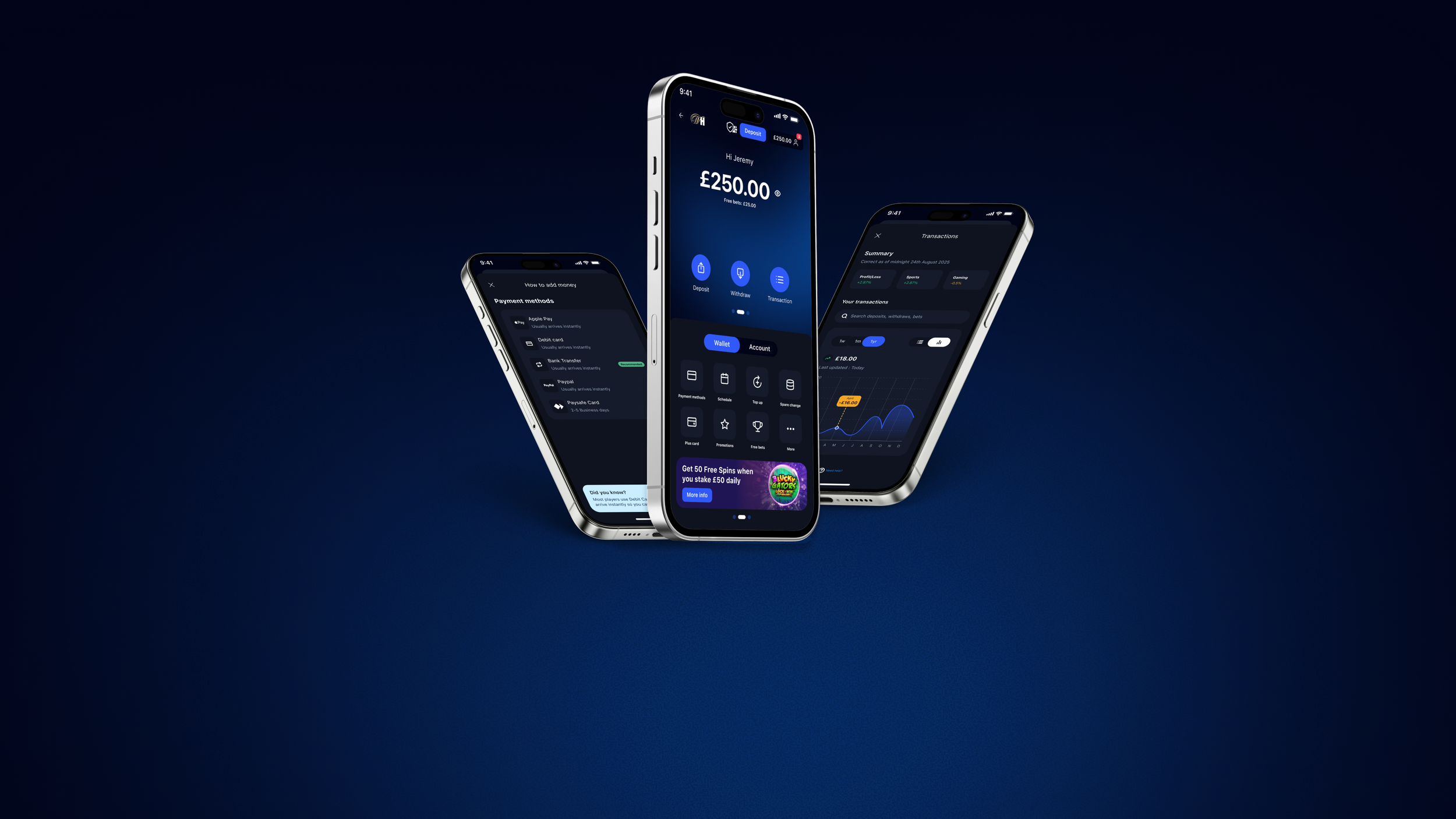
The result was a more dynamic, contextual experience built around clear actions, immediate feedback and stronger moments of engagement.
From static and transactional → to dynamic, confident and connected.
Start Your
Next Adventure
Rooted in purpose, shaped by vision, driven by results.
Welcome to a space designed for ideas that move people. With a focus on quality, clarity, and connection, we're here to help you make an impact that lasts.
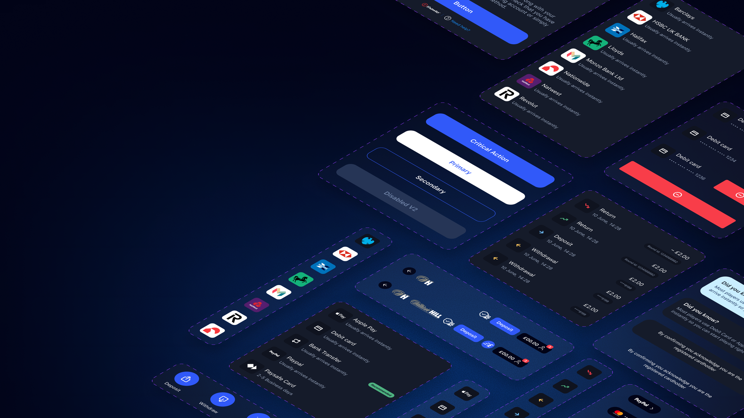
Features and Widgets
The goal was to make the features super intuitive, simple, informative and clear. Minimal fuss, pleasing visual interactions. Easy to understand cards with coloured tags which were strategically chosen to differentiate the difficulties of the task.
Hire me
I hope you enjoyed looking at my work. Lets connect and make something awesome together.